AI UX Design: Building Trustworthy User Interfaces
Discover how AI UX design can enhance user trust through transparency, explainable AI, and confidence indicators. Learn best practices now.

How AI UX Design Builds User Trust in AI Features
An AI feature can look polished and still lose users the first time it makes a confident mistake.
AI UX Design Key Takeaways
-
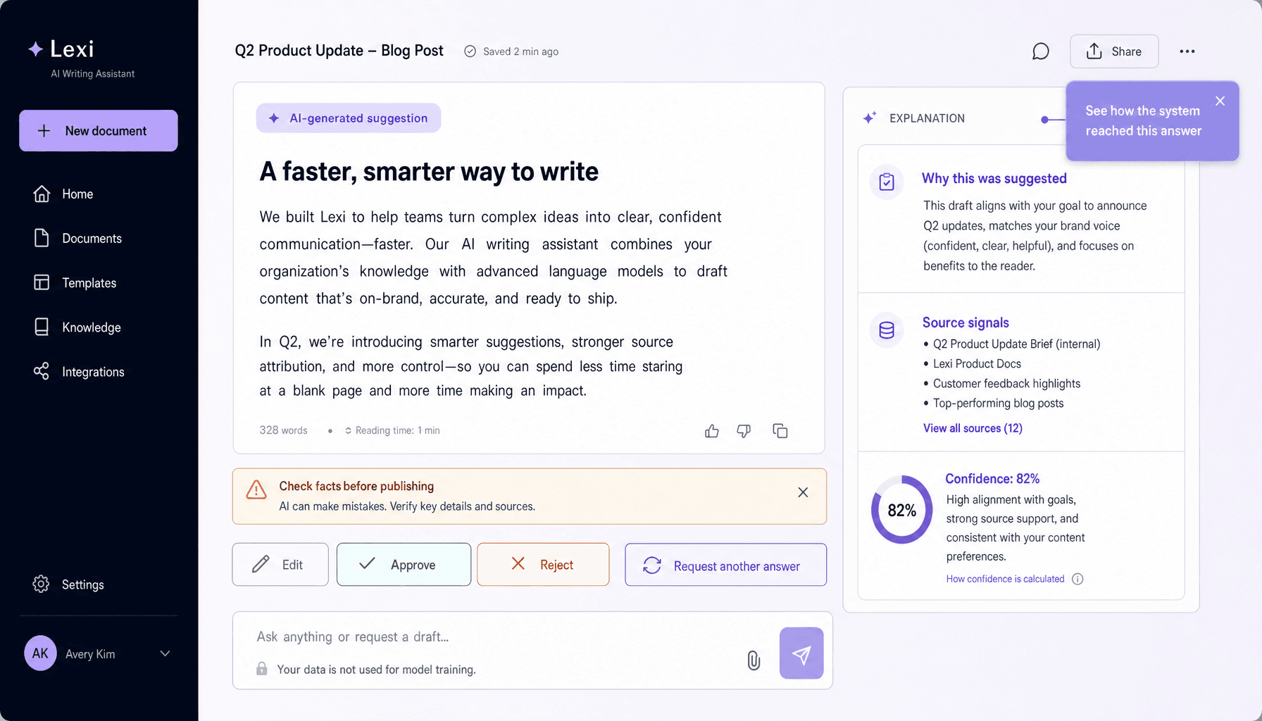
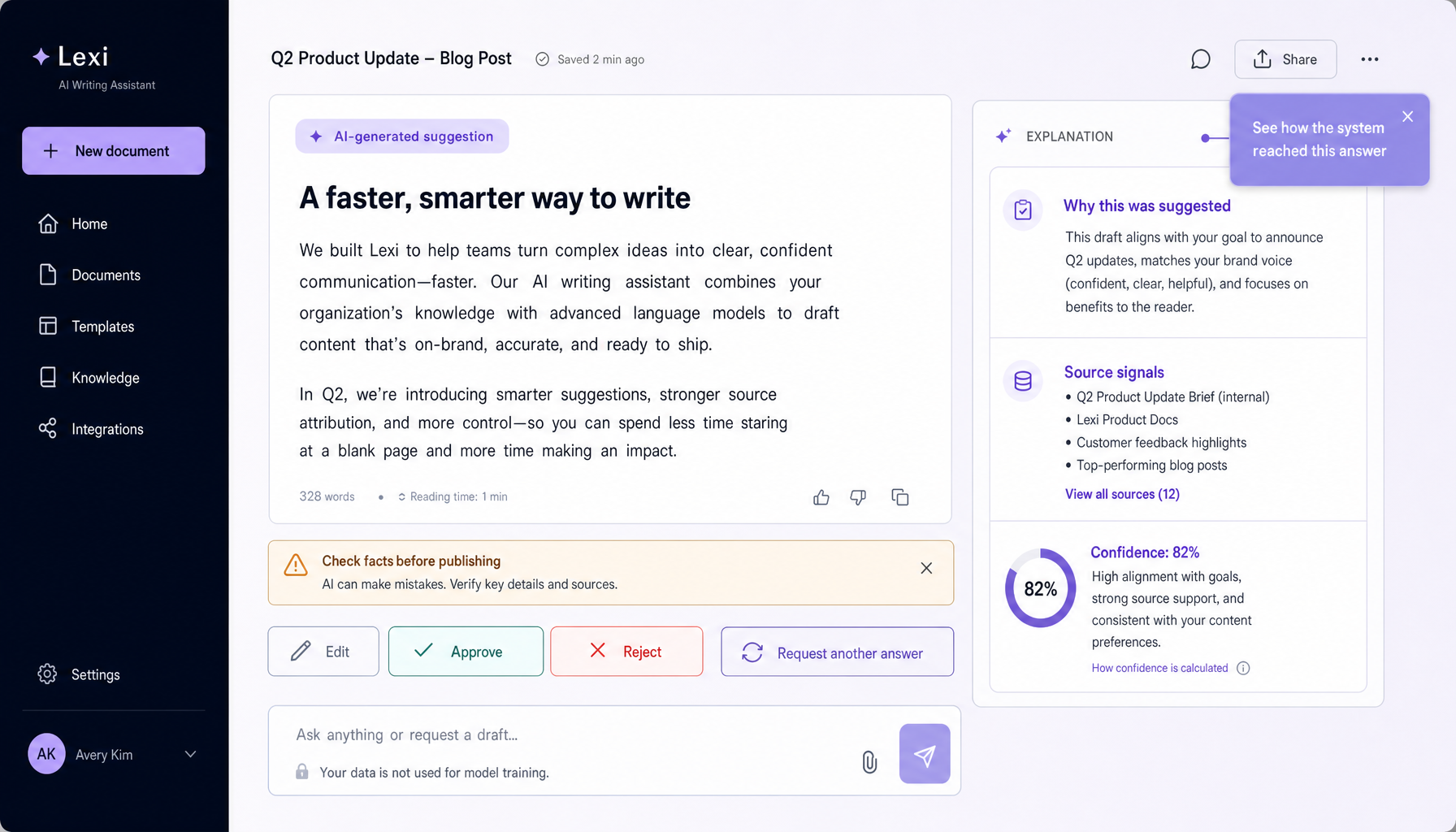
Label AI clearly and explain it in plain language. Strong AI UX design makes outputs, model actions, and data use visible -- with cues like “AI-generated,” model version labels, and short “why this result” summaries.
-
Calibrate trust instead of overselling certainty. In trustworthy AI UI, confidence states such as “high confidence,” “needs review,” or “based on limited data” help users decide when to act, verify, or escalate to a human.
-
Keep people in control with review queues, approval steps, undo actions, and fallback workflows. Good AI interface design supports human-in-the-loop decisions, especially where mistakes carry real cost.
-
Design for failure before polish. Error states should say what went wrong, what the system needs next, and how users can recover -- not hide behind vague messages or silent failures.
-
Build feedback, privacy, and onboarding into the core flow. The best AI user experience explains permissions, offers GDPR-style consent choices, and gives users a fast way to correct bad outputs. Clarity beats complexity here.
Why Trust Is the Core Success Metric for AI UX Design
Trust decides whether people keep using an AI feature after the demo.
A polished screen can make an AI tool feel fast, modern, even impressive. But AI user experience starts to break the moment users cannot answer basic questions: Can this result be trusted? Why did it do that? What data did it use? Can someone review this before it acts? In traditional software, a button usually triggers a predictable rule. In AI interface design, outputs are probabilistic. Sometimes excellent. Sometimes wrong in subtle ways. That changes the UX target.
So usability alone is not enough.
In AI UX design, trustworthiness sits above smoothness because users must judge reliability, not just complete a task. A summary tool may produce fluent text that sounds correct while missing a critical detail. An AI copilot may suggest code that compiles but violates a business rule. A recommendation engine may feel helpful until users notice it keeps pushing options they do not understand. And an automated action -- sending a reply, approving a claim, escalating a ticket -- becomes risky if the system acts before a human-in-the-loop can verify it.
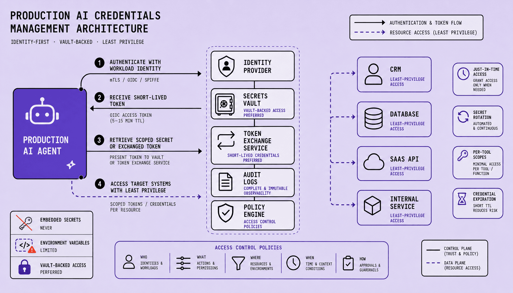
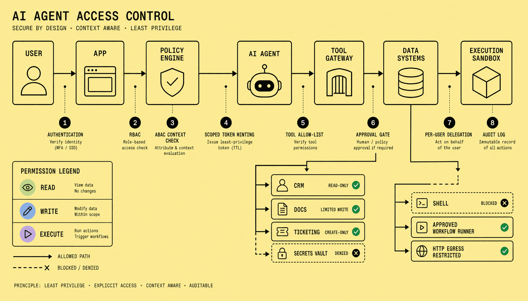
That is where trustworthy AI UI earns adoption. It shows confidence states, labels AI-generated output, explains the reason behind a recommendation, and makes review queues, audit logs, and override controls easy to find. Those are not cosmetic touches. They define the control boundary.
Because opaque convenience creates automation bias.
If the interface is too smooth, users may over-trust weak outputs. If it is too defensive, they ignore the feature. The tradeoff is real: speed versus control. Strong human-centered AI design handles it with progressive disclosure -- quick answers first, deeper explanation and intervention paths on demand.
Here is a practical rule: any AI feature that can affect money, compliance, records, or customer communication should expose verification cues before execution, not after failure. Even accurate models can fail at the AI user experience layer if people do not know when to verify, intervene, or opt out.
That is why trust is the primary success metric for decision support systems, AI copilots, summaries, recommendations, and automations.
Use Transparency, Explainable AI UX, and Confidence Indicators Together
If users have to guess whether a result came from AI, what drove it, or how reliable it is, the interface has already made the decision harder than it should be.
A trustworthy AI UI should show three things, right where the decision happens: this came from AI, here is why, and here is how certain the system is.
Make the AI visible first
Teams often hide AI behind polished UI copy. Bad move. If a summary, recommendation, or flag is machine-generated, label it clearly in the interface. Use direct text such as “AI-generated draft,” “Suggested by AI,” or “Auto-classified from uploaded files.” In strong AI interface design, visibility comes before persuasion.
Do not bury that label in a tooltip or help center.
A visible label sets expectations early. Then the user knows whether to skim, verify, edit, or escalate.
Explain the reason in plain language
Once users know AI was involved, the next question is obvious: Why this result? Good explainable AI UX answers that without dragging people through technical jargon.
Show the immediate reason first, then deeper detail on demand. That is where progressive disclosure works well. Put a short explanation beside the output, then let users expand for more context, source attribution, model version labels, or an audit log.
A useful explanation sounds like this: “Flagged for review because the invoice total is much higher than recent invoices and the vendor bank details changed.”
That beats vague system text like “Potential risk detected.”
In practice, explainable AI UX should answer the user’s real question: Why did this happen to this item right now? If relevant, include source references such as document names, fields used, or matched records. But keep the first layer plain-language. Not model theory.
Show confidence without pretending certainty
Even a decent explanation is not enough if the UI presents every output as equally reliable.
Confidence indicators help users judge whether to act or verify. Use simple states such as “high confidence,” “limited data,” or “needs review.” In some workflows, a confidence interval or calibration detail may belong in the expanded view, especially for expert users. Most people do not need that upfront.
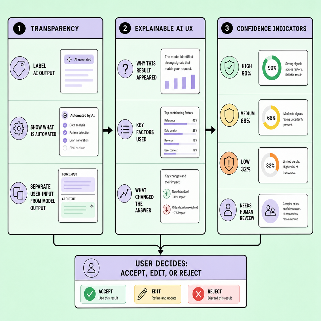
Too much uncertainty detail can slow routine tasks and clutter the AI user experience. So show confidence most prominently when the cost of error is high, the output is hard to verify quickly, or human-in-the-loop review is required. For lower-risk suggestions, a lighter confidence cue is often enough.
The goal is not to expose every model detail. It is to give users enough context to judge output quality without breaking flow.
Design AI User Experience for Human Oversight, Error Handling, and Feedback Loops
Trust breaks fastest when AI is wrong and the interface makes recovery hard. That is why the safest AI user experience does not just generate outputs. It gives users control before, during, and after the model acts.
Start with the right control patterns. For any high-risk action, require review-before-send. A good example: an AI-generated payment approval note, legal response, or customer email sent to a live account should land in a review queue before it goes out. Low-friction automation feels great in demos. Explicit review checkpoints are the better tradeoff when the cost of a silent error is reputational, financial, or operational.
Build for review, override, and recovery
Once AI can influence real actions, the interface has to make safe next steps obvious.
A trustworthy AI UI should make the next safe action obvious:
- Review-before-send for messages, approvals, and external actions
- Edit and override so users can change text, parameters, or decisions without fighting the system
- Undo pattern for reversible actions
- Escalation path to a human when confidence is low or context is missing
- Fallback workflow when the model fails, times out, or returns an unusable result
Because AI errors are different from normal software errors. Traditional bugs often look broken. AI failures often look polished, fluent, and believable while still being wrong. That is the dangerous case. The interface should treat uncertain output as something to verify, not something to decorate.
Do not treat a thumbs-up or thumbs-down button as a complete feedback loop.
Make feedback useful without making it annoying
Feedback controls often fail for a simple reason: they collect sentiment, not correction.
A better pattern is to pair lightweight reporting with structured correction. If a summary is wrong, let the user mark incorrect facts, missing context, wrong tone, or unsafe action, then optionally edit the result inline. That creates a usable feedback loop without forcing a long form.
In practice, good human-centered AI design also logs the event context: prompt, model version label, confidence state, user edit, and whether the issue triggered escalation. Not for surveillance -- for debugging and quality control.
And keep the fallback visible. “Try again,” “Use manual workflow,” and “Send to reviewer” are not edge-case buttons. They are core trustworthy AI UI patterns.
Build Trust Early With Privacy Signals and Onboarding in AI UX Design
The trust problem does not start at the first wrong answer. It starts earlier, when users are deciding whether they should even try the feature.
In strong AI UX design, onboarding is not a product tour and it is not a sales pitch. It is the moment the interface sets user expectations about data use, control, and limits. Teams often lose first-use trust with vague promises like “smart recommendations” or “personalized help.” Users do not need hype. They need specifics.
Use privacy signals to answer the first silent question
Before people try an AI feature, they usually want to know one thing: What is this using from me? A trustworthy AI UI should answer that in plain language, close to the permission prompt -- not buried in a legal page.
A clear privacy notice can say:
“This feature uses your prompt and selected files to generate a response. Your content is stored for 30 days to improve session history. It is not used to train the model without your consent.”
That level of detail covers consent, data retention, and purpose in one short message. Good AI interface design also scopes permissions tightly: “Use this document only,” “Access calendar summaries,” or “Turn on chat history.” Not blanket access. Not implied sharing.
Teach boundaries before users make mistakes
Privacy answers one trust question. Capability boundaries answer the next one.
Onboarding should also show what the AI can and cannot do. One short first-run screen can say: it can summarize uploaded notes, draft replies, and suggest categories; it cannot verify legal accuracy, make final approvals, or act without review. Specificity beats marketing language every time.
Because trust drops fast when the system appears more capable than it is.
In practice, the best AI user experience includes a brief verification cue at first use: “Review facts, calculations, and names before sending.” That small instruction frames human oversight as normal behavior, not as a failure of the tool.
Balance low friction with informed consent
There is a tradeoff here. Short onboarding reduces drop-off, but oversimplified consent creates bad surprises later. So the right pattern is progressive disclosure: show the essential privacy notice, permission scope, and safe-use guidance up front, then link to deeper controls like retention settings, audit logs, and model-use details.
Good AI user experience feels easy.
But it never hides the terms of trust.
Common AI UX Design Mistakes and a Best Practices Checklist
Most trust failures in AI UX design are not caused by the model alone. They come from ordinary product shortcuts -- vague labels, missing empty states, weak error state design, and no way to undo or review AI actions.
The worst pattern is simple: hide the AI, sound certain, and remove user control. A stronger trustworthy AI UI does the opposite. It labels AI output, shows confidence in plain language, offers a “why this result” path, and includes an override control before high-impact actions are finalized.
Trust also breaks when feedback flows disappear into a void. If users flag a bad answer, the interface should confirm what happened next: saved for review, added to a review queue, or used to improve future suggestions. Visible auditability matters.
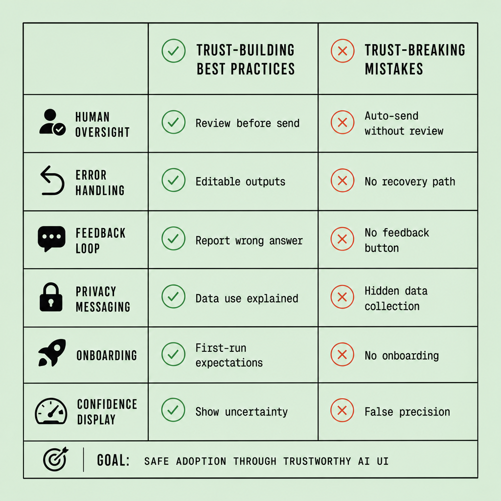
Design review checklist
Use this during product reviews:
- Is AI use clearly labeled at the moment of output or action?
- Does the UI avoid overconfident copy like “done” or “correct” when uncertainty exists?
- Can users open a short explanation path without leaving the task?
- Is there an override control, edit option, or human-in-the-loop fallback?
- Do empty state and error state screens explain limits and recovery steps?
- Are privacy choices clear -- with consent, retention, and permission prompts stated plainly?
- Does feedback get acknowledged with a status, not vanish silently?
- Can teams trace model version labels, decision history, or auditability records if needed?
That is the practical standard for better AI user experience and durable best practices.
Frequently Asked Questions
What makes AI UX design different from traditional UX design?
AI UX design must help users judge probability, not just complete steps. Traditional UX usually supports predictable system behavior, while AI interfaces must communicate uncertainty, source context, and review options so people can decide when to trust, verify, edit, or reject an output.
How does trustworthy AI UI reduce over-reliance on AI outputs?
A trustworthy AI UI reduces over-reliance by making limitations visible before action. Clear confidence labels, explanation layers, manual review controls, and explicit approval steps interrupt blind acceptance and remind users that AI output is assistance, not final authority.
Why should AI UX design include role-based controls?
Role-based controls matter because not every user needs the same level of access or explanation. Frontline users may need simple review cues, while managers, auditors, or specialists may need model history, decision logs, or escalation authority to govern higher-risk actions responsibly.
What is the best way to test AI user experience before launch?
The best way to test AI user experience is with scenario-based usability testing that includes correct outputs, borderline cases, and realistic failures. Teams should measure whether users notice AI involvement, interpret confidence correctly, recover from errors quickly, and choose safe actions under time pressure.
How should teams measure whether their AI interface design is actually building trust?
Teams should measure trust through behavior, not opinion alone. Useful signals include review-rate accuracy, override frequency, successful recovery from bad outputs, consent acceptance patterns, repeat usage after failures, and whether users follow recommended verification steps without excessive friction.
Make Imversion a preferred source on Google
Like this kind of AI and software analysis? Add Imversion as a preferred source so Google can highlight our articles for you in Search, AI Overviews, and AI Mode.